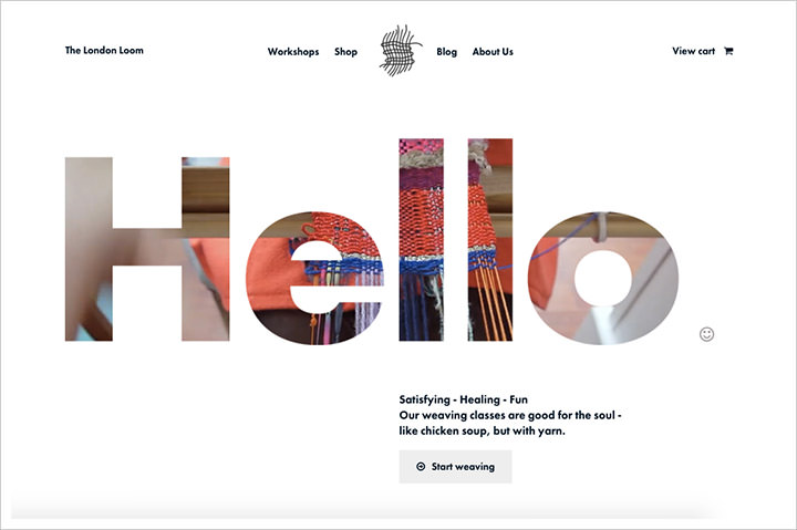
Minimalism has become one of the most prevalent trends in the creative industry, with its alternative, maximalism, being increasingly marginalized.
A cursory glance at Google Trends shows that maximalism is not getting much attention, suggesting minimalism is design’s holy grail. This trend is apparent across various industries, including graphic design, interior design, and arts.
This article aims to examine the advantages and drawbacks of minimalism in UI/UX design. Doing so will enable entrepreneurs to make informed decisions on what design approach is suitable for their business, instead of just flocking with the trends.
What is minimalism in web design?
Minimalism is a design approach that emphasizes simplicity, clarity, and a focus on the essential elements. It is a design style that strives to remove all non-essential elements and distractions while prioritizing functionality and user experience.
Minimalist design is commonly recognized by its limited use of color, flat design style, and emphasis on typography and text. Some well-known examples of minimalist design in news websites include Readywebsolution.com, BusinessWorld.Africa and TechCrunch.com.
In contrast, websites such as CNN.com, and TheVerge.com can be classified as maximalist due to their use of bold, complex designs featuring rich visual elements, dynamic animations, and interactive features.
Here are some of the benefits of minimalism in website design.
Clarity and focus
Minimalist design emphasizes simplicity, clarity, and user focus. By eliminating unnecessary elements and simplifying the design, minimalist design helps users focus on essential features and content.
This clarity and focus are essential for creating a positive user experience. Minimalist design can also make it easier for users to navigate the interface, reducing confusion and increasing user satisfaction.
For example, the minimalist design of Google’s search engine emphasizes the search bar and search button, making it easy for users to find and use the search function. The minimalist design also makes it easier for Google to load the page quickly, improving the user experience.
Faster loading speeds
Minimalist design can improve loading speeds by reducing the number of elements on the page. By reducing the number of elements, minimalist design reduces the amount of data that needs to be loaded, resulting in faster load times.
This faster loading speed can improve the user experience and reduce the likelihood of users abandoning the website or application due to slow loading times.
For example, the minimalist design of Dropbox’s website eliminates unnecessary elements, resulting in a faster loading speed. This fast loading speed improves the user experience and makes it more likely that users will continue to use Dropbox.
Consistency and branding
Minimalist design can also improve consistency and branding by simplifying the design and focusing on essential elements. By eliminating unnecessary elements and emphasizing essential features, minimalist design can make it easier to create a consistent brand image across different platforms and devices. This consistency can help build brand recognition and increase user trust.
For example, Apple’s minimalist design emphasizes the essential features of its products and creates a consistent brand image across different devices and platforms. This consistency has helped to build brand recognition and increase user trust in Apple’s products.
Increased user engagement
Minimalist design can increase user engagement by simplifying the user interface and making it easier for users to interact with essential features. By reducing the number of distractions and focusing on essential features, minimalist design can encourage users to engage with the application or website.
For example, the minimalist design of Instagram’s mobile application focuses on essential features such as photos, comments, and likes. This focus on essential features makes it easier for users to engage with the application and encourages them to interact with other users.
Mobile-friendly design
Minimalist design is ideal for mobile devices due to its simplicity and focus on essential features. By eliminating unnecessary elements, minimalist design can make it easier to navigate and interact with essential features on small screens. This mobile-friendly design can improve the user experience and increase user engagement on mobile devices.
For example, the minimalist design of Airbnb’s mobile application makes it easy for users to find and book accommodations on their mobile devices. This mobile-friendly design has helped to increase user engagement and has made Airbnb a popular choice for mobile users.
Now that you know the benefits, let’s discuss the limitations of minimalism in UI/UX design:
Lack of distinctive design
Minimalist design often relies on a limited color palette, typography, and other design elements. This limited range of design elements can make it challenging to create a distinctive design that stands out from other designs.
When minimalist designs are overused, they can start to look generic and lack personality, making it difficult to differentiate a brand from competitors.
For example, while Apple’s minimalist design has helped to create a consistent brand image, it has also been criticized for lacking personality and uniqueness, particularly in its recent product launches.
Difficulty communicating complex information
Minimalist design can be challenging when it comes to communicating complex information. Because minimalist designs often rely on simplicity, they can struggle to convey complex ideas or concepts effectively. As a result, designers need to be careful not to oversimplify their designs and risk losing critical information.
For example, the minimalist design of some financial applications can make it difficult for users to find and understand important information such as investment performance or tax implications.
Limited flexibility
Minimalist design can be inflexible and challenging to adapt to new or changing needs. Because minimalist designs emphasize simplicity, designers may struggle to incorporate new features or elements without compromising the overall design’s simplicity.
This limited flexibility can be particularly challenging in rapidly evolving industries where design needs to adapt quickly.
For example, a minimalist design for a news website may struggle to incorporate new multimedia content or interactive features that are becoming more popular in the industry.
Overemphasis on visual design
Minimalist design can also overemphasize visual design at the expense of usability and functionality. Because minimalist design relies on simplicity and essential features, designers may prioritize visual design over usability, resulting in a less effective user experience.
This overemphasis on visual design can result in a website or application that looks good but is difficult to use.
For example, a minimalist design for a navigation bar may prioritize visual design over usability, resulting in a navigation bar that is challenging to use and understand.
Potential for boredom and lack of engagement
Minimalist design can also be challenging to maintain user engagement and excitement. Again, because minimalist designs often emphasize simplicity and essential features, there is a risk that users may become bored or disengaged if the design is too simplistic.
Designers need to strike a balance between simplicity and engagement to keep users interested and motivated to use the website or application.
Ready Web Solution provides expert-level minimalist website design services for small, medium, and large types of businesses. Our expert team of web designers knows how to design modern business websites.


