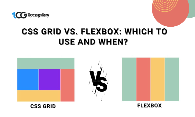
When it comes to creating responsive and flexible layouts in web design, CSS offers two powerful tools: Grid and Flexbox. Both are essential for creating modern web layouts, but understanding their strengths and use cases is crucial to deciding which suits your needs.
CSS Grid: Powerful for Overall Page Layouts
CSS Grid is a two-dimensional layout system that allows you to create grid-based designs. It provides explicit control over rows and columns, perfect for building complex, multi-dimensional layouts.
Strengths of CSS Grid:
Grid Lines, Tracks, and Areas:
CSS Grid introduces the concept of grid lines, allowing designers to create columns and rows explicitly. This feature enables the creation of intricate layouts by defining tracks (columns and rows) and organizing them into areas where elements can be placed. For instance, a website with a header, sidebar, main content, and footer can be easily structured using CSS Grid, giving precise control over placement and sizing.
Alignment and Distribution:
Grid brings exceptional alignment capabilities. Items within the Grid can be placed precisely using properties like `justify-items`, `align-items`, `justify-content`, and `align-content`. This control extends to individual items and entire grid containers, making it effortless to position elements exactly where desired.
Responsive Design Made Easier:
One of Grid’s standout features is its innate ability to handle responsive design effortlessly. By using media queries and defining grid layouts for different screen sizes, designers can rearrange grid areas and modify column or row sizes based on various devices. This makes it an ideal choice for creating adaptive and responsive web designs.
Two-Dimensional Layout:
Grid enables the creation of both rows and columns simultaneously; thus, web designers can design intricate layouts for their projects.
Best Use Cases for CSS Grid:
- Page Layouts: Ideal for designing entire page structures with multiple sections and complex arrangements.
- Responsive Design: Great for managing layout changes across various devices.
- Grid-Style UIs: Websites with card-based layouts or image galleries benefit from the Grid’s alignment and structure capabilities.
As we learn about the CSS Grid, it’s time to explore the hidden facts of Flexbox and why web developers use this to develop websites.
Flexbox: The Art of One-Dimensional Layouts
Conversely, Flexbox focuses on creating layouts in a single dimension—either as rows or columns. It excels at distributing space among items in a container along a single axis.
Strengths of Flexbox:
-
Simplified Directional Layouts:
Flexbox excels in arranging elements in a single direction – either horizontally or vertically. It provides a powerful solution for smaller-scale layouts where items need to be arranged in a row or column, offering control over the distribution of available space and the alignment of individual items within a container.
-
Item-Level Control:
Unlike Grid’s emphasis on entire grid areas, Flexbox shines when it comes to controlling individual items within a container. With properties like `justify-content`, `align-items`, `flex-grow`, and `flex-shrink`, designers can easily control how items grow or shrink within a container, ensuring a clean and flexible layout.
-
Nested Layouts and Component Arrangement:
Flexbox’s ability to nest easily within other Flexbox layouts or Grid containers makes it a versatile tool for creating component-based designs. It can be used for items within cards, navigation menus, or any section that requires specific alignment or spacing for its elements.
-
Responsive Behavior:
Flexbox offers the facility to handle dynamic content and varying sizes of items flexibly. So the user can expand their creativity to develop the project with multiple contents without thinking out the sizes and various.
-
Content Alignment:
Alignment of content is another ridge task for users. Fortunately, the flexbox offers excellent control over aligning items, whether centered, at the start, end, or space between. So, if you are looking for an alignment-friendly option, then you can consider this tool.
Apart from this, there are some more cases where you can use the Flexbox.
Best Use Cases for Flexbox:
- Navbars and Menus: Perfect for arranging navigation items horizontally or vertically.
- Item Alignment: Ideal for aligning items like buttons or form elements within a container.
- Flexible Content: Suited for components that need to adjust dynamically, such as comment sections or user-generated content.
After understanding the basics of CSS Grid and Flexbox, you might get an idea about what you need to use for your web design project. Yet, if you still want to learn more about when to choose CSS Grid and when to select Flexbox for a project.
CSS Grid vs Flexbox – Choosing the Right Tool for the Job
When to Choose CSS Grid:
Here are five points that will help you determine when to choose CSS Grid
#1: Multi-dimensional Layouts:
CSS Grid is optimal for intricate designs requiring elements positioned in both rows and columns simultaneously, making it ideal for complex, multi-dimensional layouts like dashboards or magazine spreads.
#2: Precise Page Structures:
When you need detailed control over the entire layout framework of a webpage, including rows, columns, and areas, CSS Grid excels in providing the necessary structure and control.
#3: Grid-like Structures:
For projects that demand a grid-based structure resembling spreadsheet layouts or intricate arrangements of content blocks, CSS Grid’s ability to handle these arrangements efficiently is a significant advantage.
#4: Complex Responsive Designs:
It’s advantageous in creating complex responsive designs, allowing for granular control over how content rearranges and adjusts across various screen sizes and devices.
#5: Layered or Overlapping Content:
When your layout requires elements to be layered or overlapped in specific patterns or arrangements, CSS Grid’s ability to manage these overlapping items seamlessly is beneficial.
When to Choose Flexbox:
Here are five points delineating when to choose Flexbox:
#1: Linear Structures:
Flexbox excels in creating layouts in a single direction, such as rows or columns. It’s especially suited for linear structures like navigation menus, lists, or a series of cards where items flow in a single direction.
#2: Item-Level Precision:
Flexbox shines when precise control over individual item alignment, ordering, and sizing within a container is crucial. It allows fine-tuning the layout of components within a section of a webpage with ease.
#3: Responsive Design Elements:
Flexbox is valuable for creating responsive design elements that require items to adapt to different screen sizes, allowing for fluid resizing and reordering without affecting the entire layout structure.
#4: Dynamic Content Layouts:
It’s particularly useful when dealing with dynamic content where the number of items may vary, as Flexbox can automatically adjust the layout based on the available space and content size.
#5: Space Distribution:
Flexbox offers excellent control over how space is distributed among items within a container, making it suitable for scenarios where you need specific control over spacing, alignment, and distribution of elements.
Combining Both:
In many cases, projects benefit from a combination of both Grid and Flexbox. Grid can define the page’s overall structure, while Flexbox can handle the finer details within those larger sections.
Consider Project Requirements:
Evaluate the specific layout needs of your project. CSS Grid is likely more suitable if the layout involves a complex grid system with intricate row-column arrangements. Flexbox might be better for simpler, linear layouts focusing on item-level control.
Responsive Design:
Both Grid and Flexbox can be used in creating responsive designs and adapting layouts to different screen sizes. Flexbox might be preferred for smaller, more linear adjustments, while Grid offers broader layout restructuring.
Ultimately, the choice between CSS Grid and Flexbox often depends on the specific layout requirements and the level of control needed over the structure and items within a design.
Wrap Up
CSS Grid and Flexbox are indispensable tools in a web designer’s toolkit, each catering to different layout needs. While CSS Grid is excellent for large-scale, multi-dimensional layouts, Flexbox excels in smaller-scale, one-dimensional layouts and item-level control.
Choosing between them depends on the specific requirements of your design project. Often, a combination of both Grid and Flexbox can offer the flexibility needed to create responsive, visually appealing, and user-friendly websites across various devices and screen sizes.
However, if you are a web designer and want to enhance your web designing skills, follow TopCSSGallery. This is the most knowable resource for all the web designers and developers community to provide them updated stats, facts, and tips. That helps them enhance their creativity with time. To learn more, explore www.topcssgallery.com now.


